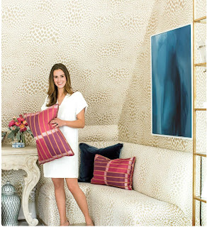
I am sure you are noticing the color crush on blue. For the last 10 years, aqua seems to have been the trending color. While various light shades of aqua mixed with neutrals is still trending, I am noticing a new bold blue. From Peacock blue to a rich cobalt blue to navy, these deeper blues are appearing on everything from walls to cabinets to sofas.
As an artist who LOVES color, I want to show you how to use blue with it's complimentary color. Don't be afraid of purchasing my brightly colored watercolors, they go with the new blue!
Compliment, orange, warms up an all blue room!
Loving the magenta in the print on the right!
Wishing the print on the left had some
magenta to balance it out. Try this right now,
cover the print on the right with your hand,
look at the photo, this is the look and feel of
decorating with analogous colors (colors next
to each other on the color wheel). Now cover the
print on the left. Which feel do you like better?
Which way can you live everyday?
cover the print on the right with your hand,
look at the photo, this is the look and feel of
decorating with analogous colors (colors next
to each other on the color wheel). Now cover the
print on the left. Which feel do you like better?
Which way can you live everyday?
Notice how interior designer, Amy Berry,
is adding the magenta & purple pillows
and deeper blues in the pillow and art
and deeper blues in the pillow and art
to this all neutral room.
Again, pulling in the complimentary color,
orange, it warms up the room while adding
a pop of color.
Shop Liana Yarckin's Art
www.lianayarckin.com
email me to commission your custom piece of art
Shop Liana Yarckin Prints, Pillows & more
Shop Liana Yarckin's Art
www.lianayarckin.com
email me to commission your custom piece of art
Shop Liana Yarckin Prints, Pillows & more


No comments:
Post a Comment
Thanks so much for taking the time to leave your thoughts. I love hearing from you!